
TellMyStory – AI Storytelling & Memory Platform
The client
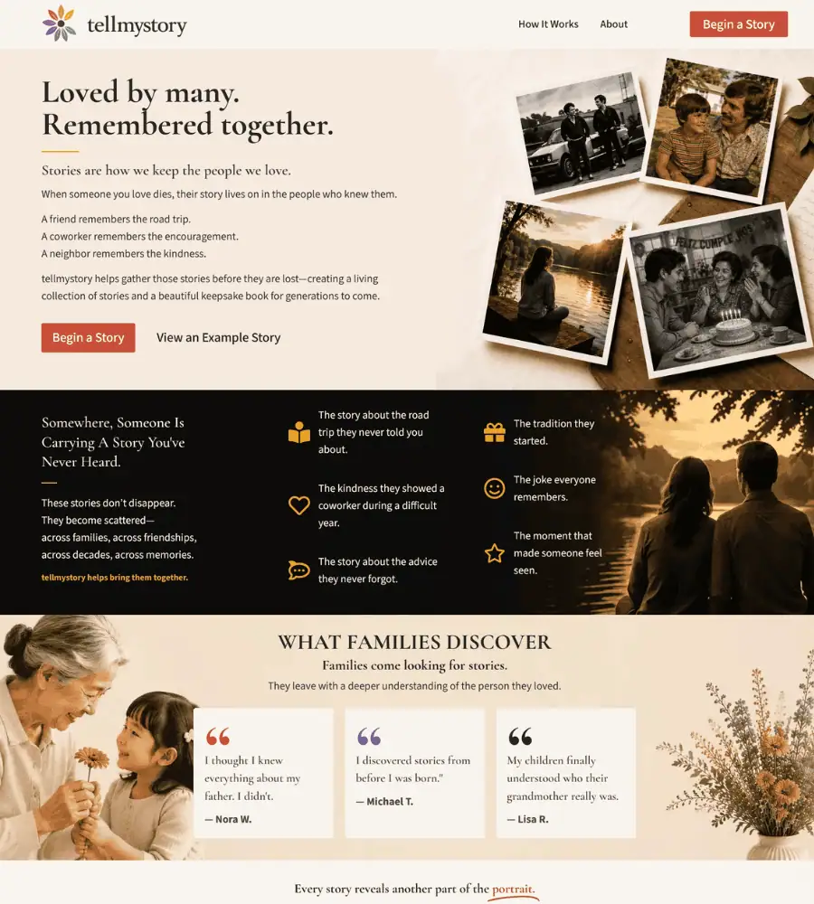
tellmystory is a platform for gathering the stories people leave behind. When someone dies, the memories of them scatter — a friend remembers the road trip, a coworker remembers the encouragement, a neighbour remembers the kindness. The platform brings those together into a living collection and, eventually, a keepsake book.
It is a genuinely difficult brief. The subject is bereavement.
The problem
Most software marketing shouts. Bold claims, urgent buttons, colour designed to grab attention. Every instinct that works for a SaaS product is wrong here.
Someone arrives at this site days or weeks after a funeral. They are not comparing features. They need to understand quickly what this is, feel that it is safe to trust with something precious, and be able to begin without friction.
The design challenge was restraint: build something that feels considered and calm, while still doing the job of explaining a five-step product and converting a visitor into a first story.
What I built
A complete WordPress site using Elementor Pro, designed around the emotional state of the person arriving.
A homepage that explains by example. Rather than describing the product abstractly, the page opens with the specific: “A friend remembers the road trip. A coworker remembers the encouragement.” Anyone who has lost someone recognises that immediately. Understanding arrives before any feature is mentioned.
A five-step process, laid out plainly. Tell a story → start a circle → grow organically → shape the collection → share the legacy. Numbered, spaced, and written so a grieving person can follow it without effort.
Real stories as proof. Contributed memories are shown as they appear on the platform, with view, comment and photo counts. It demonstrates the product working better than any description of it could.
Testimonials that name the real problem. “The stories were pouring out after the service. I realized we’d lose them by Monday if someone didn’t capture them.” That is the moment the product exists for, in a customer’s own words.
Three clear tiers — Free Story, Story Circle, Legacy Collection — presented as a natural progression rather than an upsell ladder, with the middle option marked as most popular.
Design decisions that mattered
- A warm, quiet palette — cream and soft neutrals rather than the blues and whites of typical tech marketing
- Serif headings, which read as personal and considered rather than corporate
- Generous spacing throughout, so nothing feels rushed or crowded
- One primary action — Begin a Story — repeated consistently, never competing with itself
- Photography of ordinary moments: a birthday cake, a road trip, a quiet lake. Real life, not stock imagery of grief
The technical side
- Fully responsive across desktop, tablet and mobile — much of this traffic arrives on a phone, often shared between family members
- Performance optimised for fast loading
- Cross-browser tested
- SEO-friendly structure with clean heading hierarchy and semantic markup
- Straightforward to manage, so the team can add stories and update content without a developer
What this project shows
That good design is a response to context, not a style applied to it. The same Elementor Pro toolkit that builds a bold e-commerce store builds this — but almost every decision runs the opposite way, because the person arriving is in an entirely different state of mind.
If your product asks people to trust you with something that matters, the design has to earn that before it asks for anything.