
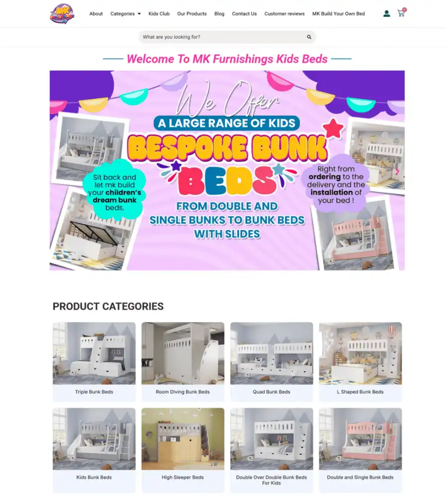
MK Furnishings – Kids Bed WooCommerce Store Redesign
The client
MK Furnishings is a UK retailer selling space-saving children’s beds — triple bunks, quad bunks, L-shaped, corner, castle beds and high sleepers. A specialist range, aimed at parents solving a specific problem: fitting two or three children into one bedroom without it feeling like a barracks.
The problem
They already had the products and the content. What they had was a site where none of it was findable.
The existing store was cluttered and inconsistent — product information formatted differently from page to page, no clear structure to the range, and a shopping experience that made a parent work to answer a simple question: which of these beds fits my room and my kids?
For a considered purchase like this, that friction is expensive. Triple bunk beds here run from £1,045 to £1,445 — nobody buys one on impulse. A parent researching one visits several times, compares options, measures their room and decides slowly, often over weeks. If the site makes that hard, they finish their research somewhere else.
What I built
A complete redesign on WordPress, WooCommerce and Elementor, working with the client’s existing content rather than starting from scratch.
A structure built around how people actually shop. The range is now organised into clear categories by bed type — Triple Bunk Beds, Room Dividing Bunk Beds, Quad Bunk Beds, L-Shaped, Corner, Castle, High Sleeper and more. A parent who knows they need a room divider goes straight there. One who is still exploring can browse by shape rather than wading through an undifferentiated product list.
Consistent product pages. Every product now follows the same layout, so the information a buyer needs appears in the same place every time. Consistency matters more than cleverness on a product page — people compare, and comparison needs a stable format.
WooCommerce configured properly. Categories, product organisation, and a checkout flow set up for a store where the average order is significant and the buyer is cautious.
Content buying guides. Editorial like the Triple Bunk Bed Buying Guide answers the questions people search before they buy — ceiling height, safety, age suitability. That brings in search traffic at the research stage and builds trust before the product page is ever seen.
Enquiry and lead capture forms for customers who want to ask before committing, with reCAPTCHA to keep the spam out.
Built for a high-value, cautious purchase
At four-figure order values, the site has to do more than display products. It has to remove the reasons someone hesitates.
Every category page now carries the things a parent actually worries about, visible without scrolling: free delivery on all orders, Klarna 0% finance, a two-year manufacturer’s guarantee, and delivery with installation. Trustpilot sits in the footer, and a freephone number and email address are on every page for the customers who want to speak to someone before spending £1,000 on a bed.
None of that is decoration. For this kind of purchase, finance availability and a guarantee are often the deciding factors — so they belong where the decision happens, not buried on a policy page.
The technical side
- Full analytics stack — Google Analytics 4, Google Tag Manager, Microsoft Clarity for session recording, Meta Pixel and Bing tracking, so the client can see what customers actually do
- Cookie consent configured for UK and EU compliance
- Cloudflare for delivery and security
- Performance optimisation — faster loading across the catalogue
- Responsive throughout — most furniture research starts on a phone, often in the room being measured
Measured on real visitors: the live store passes Google’s Core Web Vitals on mobile. Three in four mobile page loads show the main content within 1.7 seconds, with a layout shift score of 0 (Chrome UX Report via PageSpeed Insights, whole store, checked 5 October 2026).
Why this one was interesting
Redesigns are often harder than new builds. You are working inside someone else’s decisions, with content that already exists and a catalogue that already sells. The job is not to impose a new idea — it is to find the structure the content was always asking for, and build that.
Here that meant organising by bed shape rather than by anything a furniture retailer might find logical internally. Parents do not think in SKUs. They think “I have one small room and three children.”
What this project shows
Taking a cluttered, inconsistent WooCommerce store and turning it into something a customer can navigate — without throwing away the content, the products or the SEO that came before it.
If you have a store that sells despite itself rather than because of itself, that is usually a structure problem, not a design problem.
The store now runs a full measurement stack — GA4, Tag Manager, Microsoft Clarity session recording, Meta and Bing tracking — so the client can see which categories hold attention and where people drop out, and keep improving on evidence rather than guesswork.